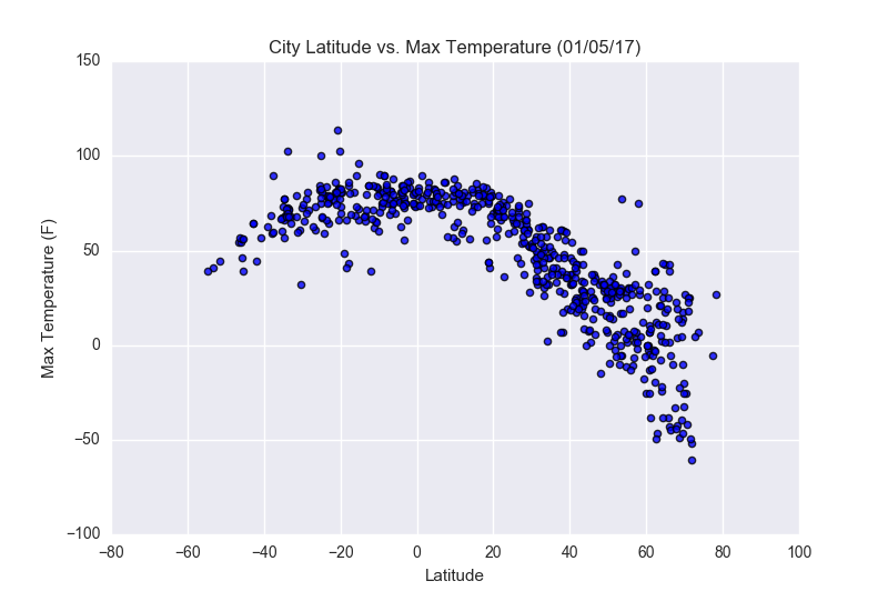
Max Temperature
City Latitude vs Max Temperature
Chart

Note: Click on the thumbnail to zoom into the visualization.
Observations
About
In this visualization, positive latitude is above the equator and negative latitude is below the equator. The x-axis represents the equator.
Notes
As one would expect, the data shows that the greater the distance from the equator (0) the max temperature recorded decreases.
It appears that there are significantly more data points available in the northern hemisphere. Despite that, there appears to be a linear relationship.